Validus Investor App
validus · INVESTOR EXPERIENCE
Validus Investor App
Redesigning the investor experience to help users understand their portfolios, make informed investment decisions and manage their investments confidently.
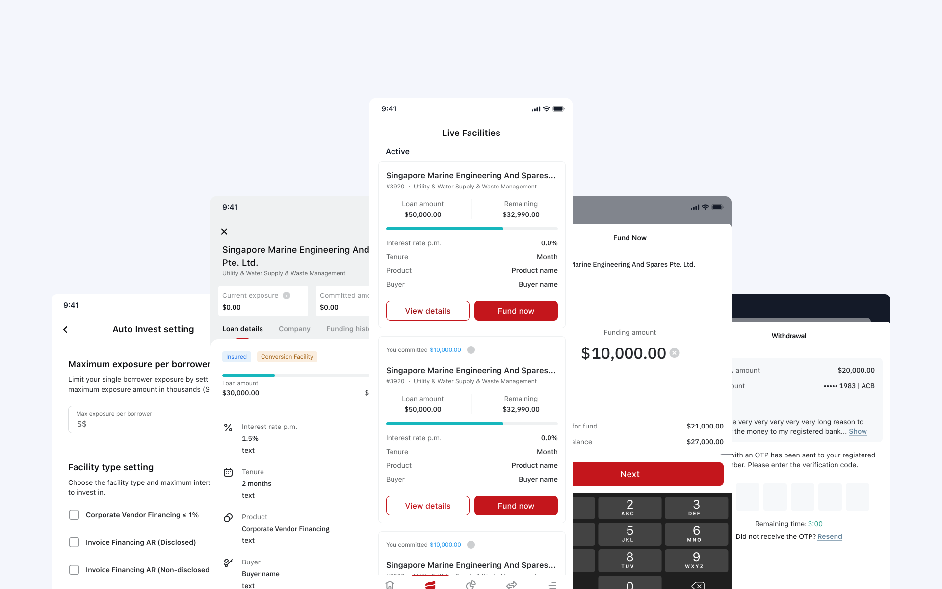
The redesigned Validus Investor App, portfolio, live facilities, facility details, investing and Auto Invest in one connected journey.
68%
Investment-flow completion
42%
Repeat investment within 90 days
31%
Auto Invest adoption
3.4 min
Median time to complete investment
Role
Product Designer
Company
Validus
SCOPE
Mobile app
Timeline
Jun 2022 → Jul 2022
An app redesign became an effort to connect the whole investment lifecycle
At Validus, I worked as a Product Designer across the Investor and Neobank experiences. Validus connects businesses seeking financing with investors looking for investment opportunities, and my work focused on making its financial products easier to understand and use.
The brief was to modernise the investor experience and make it easier for users to manage their investments. The existing app provided portfolio information, but the journey from understanding an investment to taking action was fragmented. As we explored a cleaner interface, another challenge emerged: removing information could make the experience look simpler while leaving investors less confident about their decisions.
What began as an investor-app redesign became a broader effort to connect portfolio visibility, investment decisions and automated investing into an experience built around trust and control.

The investment lifecycle in one app with tracking the portfolio, finding opportunities, investing and automating future investments.
Problem
An investor app needs to do more than display balances and returns. Investors use portfolio information to understand where their money is allocated, evaluate new opportunities and decide what to do next. If those decisions require moving between disconnected screens or interpreting information without enough context, the product can become difficult to act on, even when its interface appears simple.
The existing experience made it possible to see investments, but did not provide a sufficiently connected journey from portfolio visibility to investment action. Our early redesign explorations exposed a related issue: simplifying the presentation could remove information investors relied on to understand what they were choosing. A cleaner screen did not necessarily create a clearer financial decision.
The central problem was not how much information the app displayed. It was whether users had the right information at the point where they needed to act.

The original app had dense tables and separate tabs for snapshot, live, outstanding and closed facilities, with little connection between viewing a portfolio and acting on it.
Key limitations included:
Financial decision-making
Investors needed enough information to understand an opportunity and the consequences of committing funds.
Different investor needs
Users checking existing investments and users evaluating new opportunities needed different levels of detail.
Complex information
Portfolio values, investment terms, expected returns and transaction information had to remain understandable without overwhelming the interface.
Automation and control
Auto Invest needed to simplify repeated actions without hiding the rules governing future investments.
Existing platform foundations
The redesign had to work within the product’s underlying investment processes and support consistent implementation across the wider Validus experience.
A connected sequence: understand, evaluate, invest, manage
I redesigned the investor journey around a connected sequence: understand the portfolio, evaluate an opportunity, make an investment and manage what happens afterward. Instead of relying on visual minimalism alone, I used information hierarchy and progressive disclosure to make essential details available when a user needed them.
The experience also introduced a clearer role for Auto Invest: helping investors automate eligible future actions while keeping their choices and investment rules understandable.
What shaped the investor experience?
Prioritise clarity over visual reduction
Our early concepts explored a cleaner, more minimal interface. Reducing visual density improved the appearance of the screens, but testing revealed that some of the removed information helped investors understand and feel confident about their decisions. Rather than removing financial information simply to create more whitespace, I focused on distinguishing what users needed immediately from what they could explore when they wanted more detail. The resulting approach used stronger hierarchy, clearer grouping and contextual information.
Trade-off
More visual density than a minimal mobile trend would suggest — accepted because the goal was not to show everything at once, it was to ensure simplicity did not come at the cost of understanding.
Connect portfolio information to investment action
The original experience made the portfolio visible, but seeing what a user owned was only one part of managing an investment. I reorganised the journey so investors could move more naturally from reviewing their portfolio to exploring an opportunity and completing an investment, with supporting information appearing in the relevant context instead of requiring users to reconstruct it across unrelated screens.
Trade-off
A more connected, less modular set of screens — accepted because portfolio information became more useful as a starting point for decisions rather than an isolated reporting destination.
Make automation understandable, not invisible
An automated investment is still a financial decision. Investors need to understand what they are authorising and how the selected configuration affects future activity. I designed the Auto Invest experience around clearly presented settings, an understandable confirmation step and visibility into the automation the user had configured.
Trade-off
Less “set and forget” simplicity — accepted because this balances convenience with control: automation reduces the need to repeat an action manually, while the interface continues to communicate the choices governing that action.
Solution
Five connected capabilities help investors understand their position, evaluate opportunities and manage investment activity.
Understand portfolio performance
The portfolio overview brings investment information into a clearer hierarchy so users can identify their holdings and understand the information relevant to their current position.
Rather than presenting financial figures as an undifferentiated collection of data, the interface distinguishes primary portfolio information from supporting detail. Investors can scan their position and explore individual investments when they need a more detailed view.

Understanding the portfolio — outstanding principal first, then filters, facility summary, collection notes and the repayment schedule.
Evaluate opportunities
Investors can move from exploring an opportunity to reviewing the information needed to decide whether to invest. Clear grouping and progressive disclosure help them understand the investment without forcing every supporting detail into the first screen.
The experience preserves information that contributes to comprehension while making the primary action easier to locate and understand.
Complete an investment
The investment journey guides users from choosing an opportunity through the relevant investment details and confirmation. Breaking the decision into understandable stages helps users review their intended action before committing.
The objective is to make the journey efficient without removing the context investors need when making a financial commitment.
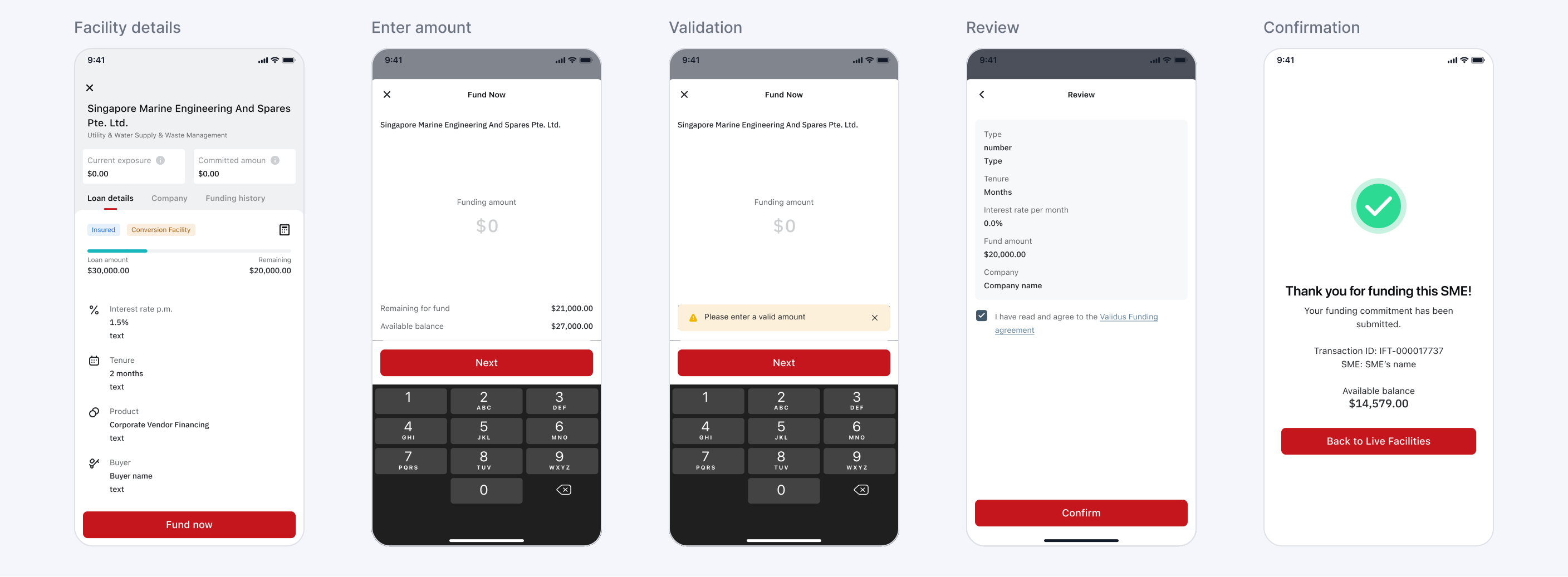
Completing an investment — facility details, amount entry with quick picks, validation warnings, review and confirmation.
Configure Auto Invest
Investors can configure automated investing through an experience that explains the choices they are making. The interface communicates the selected settings and provides a way to review the intended automation before confirmation.
This supports repeat investing without requiring users to surrender visibility into how future investments will be handled.

Configuring Auto Invest — from the empty state to setting single-borrower exposure and facility types, then saving and enabling it.
Manage investments afterward
The experience continues beyond the initial investment. Investors need to understand the investments they hold, review their activity and return to the portfolio to evaluate what has changed.
Connecting the pre-investment and post-investment journeys makes the app useful throughout the investment relationship rather than only at the moment of conversion.
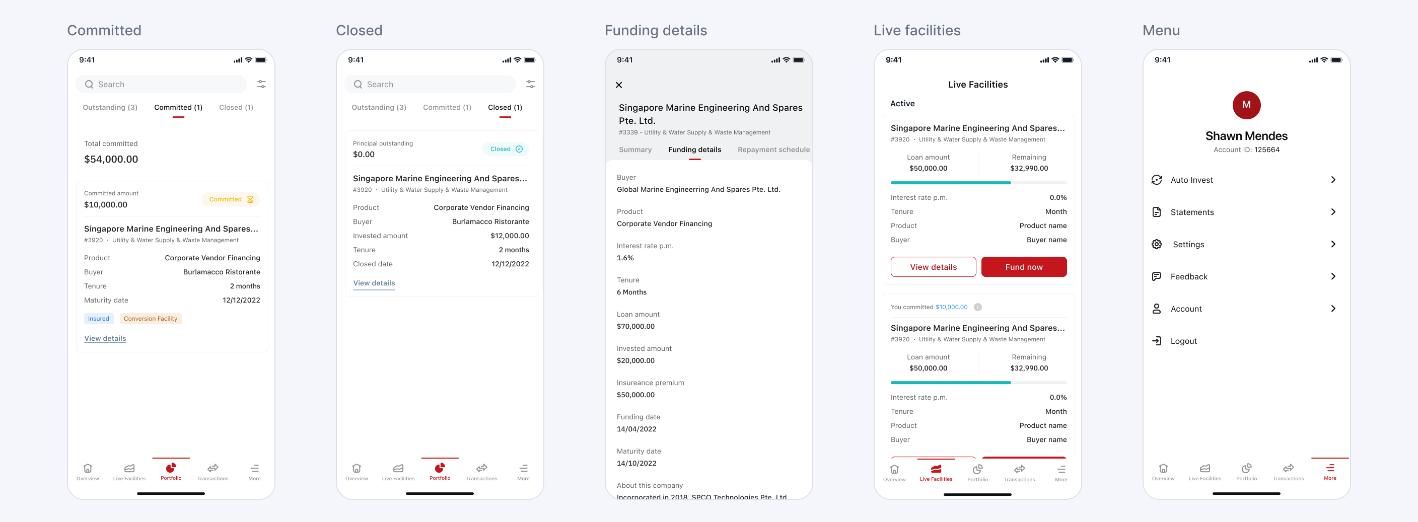
Managing investments afterward — committed and closed facilities, funding details and account menu share the same cards, tabs and hierarchy.
What changed
The redesigned experience improved how investors move from evaluating an opportunity to completing and managing an investment. Reported product metrics indicate strong investment-flow completion, meaningful repeat investment activity and steady adoption of Auto Invest.
68%
Investment-flow completion
42%
Repeat investment within 90 days
31%
Auto Invest adoption
3.4 min
Median time to complete investment
These figures describe outcomes associated with the redesigned investor experience. The measurement periods and cohorts should be shown alongside the final portfolio metrics so performance is not incorrectly attributed to a single release.
How I worked
With
Product, engineering and investor-facing teams
I worked closely with product, engineering and other stakeholders to understand what investors needed before committing money and what the platform needed to support operationally. Regular reviews helped align the investment journey, Auto Invest behaviour and post-investment experience with both user needs and technical constraints. I also involved users during concept validation to understand whether the information hierarchy gave them enough confidence to make a decision.
ARTEFACTS
Research, journeys, concepts and prototypes
My work included the existing-experience audit, investor journey maps, information architecture, investment-flow diagrams, concept comparisons, Auto Invest flows and high-fidelity Figma prototypes. I used these artefacts to compare alternative ways of presenting financial information, identify unnecessary complexity and make the relationship between portfolio visibility, investment action and ongoing management easier to understand.
VALIDATION
Testing clarity before visual simplicity
One of the key design decisions came from testing early concepts. A more minimal direction looked cleaner, but removing too much financial context made it harder for users to understand what they were investing in. I used those findings to refine the hierarchy, restore decision-critical information and progressively disclose secondary details. Validation therefore focused not only on whether users could complete the flow, but whether they understood the decision they were making.
What I learned
Clean isn’t always clear
I initially explored visual simplification as a way to make the investor experience easier to use. Testing showed that removing information could also remove the context people needed to understand a decision. I learned to prioritise useful hierarchy over reducing the amount of content on screen.
Trust depends on understanding
A financial product needs to make important information available when a user is deciding what to do. Clarity comes from helping people understand the action and its consequences, not simply making the interface look less complex.
Automation still needs visible controls
Reducing repeated effort is valuable, but investors should understand the choices they have authorised. Making automation settings and confirmation understandable helps preserve control as more activity becomes automated.
Design the complete investment journey
Portfolio visibility, opportunity evaluation, investing and ongoing management are connected parts of one experience. Improving an individual screen matters less if users still struggle to move between those activities.
What’s next
The redesigned experience provides a clearer foundation for investment decisions and automated activity. The next opportunity is to help investors understand their ongoing investments and automation choices as circumstances change.
Future improvements could provide more contextual explanations of investment activity, clearer visibility into Auto Invest behaviour and better support for reviewing previously configured settings.
The aim is to make the app useful not only when someone decides to invest, but throughout the period in which they manage and review their investments.
More case studies