Validus Design System
validus · design system
Validus Design System
Building a shared design system that helps product, design and engineering teams deliver consistent experiences across products.
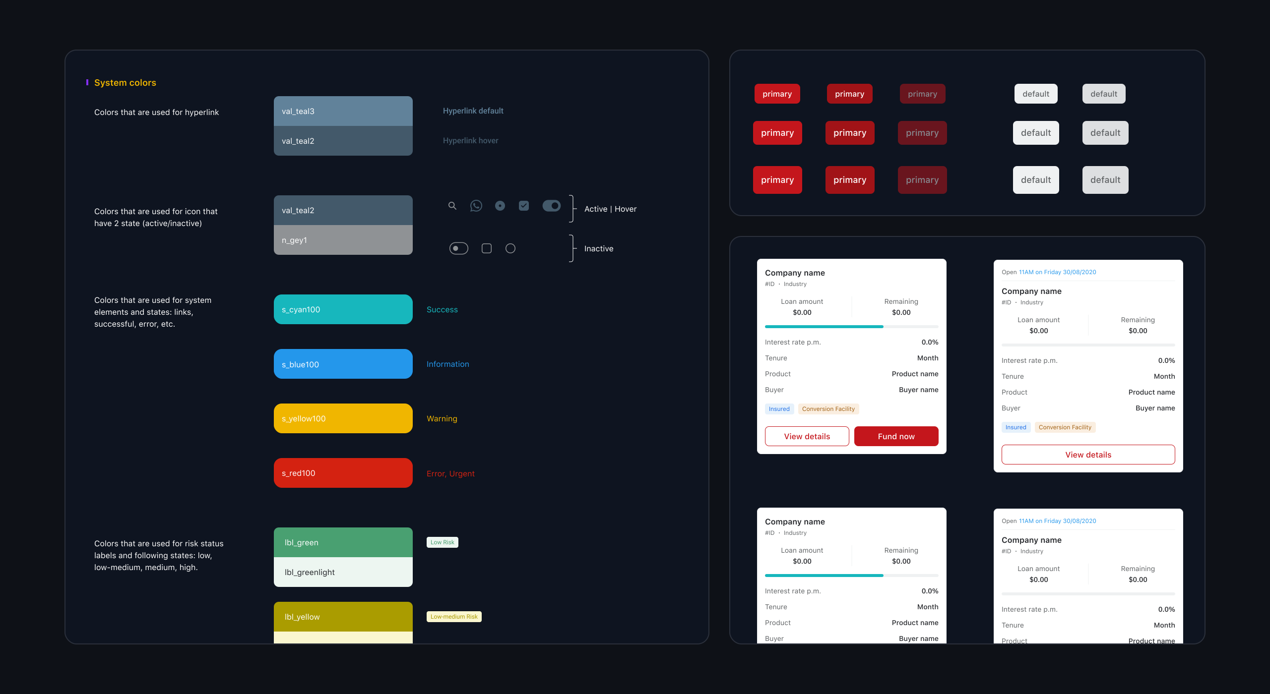
The Validus design system — documented foundations, components and investor patterns shared across mobile and web.
~6 months
to near-total adoption
60%
faster component integration
70%
fewer UI escalations & bugs
50%+
shorter design-to-launch
Owned: product audit, foundations, component architecture, theming, Figma ↔ Storybook alignment, documentation, adoption and governance.
Role
Product Designer
Company
Validus
SCOPE
Mobile and Web app
Timeline
Feb 2022 → May 2022
An effort to improve UI consistency became a shared foundation
At Validus, a fintech company providing financing solutions to businesses across Southeast Asia, I worked as a Product Designer across the Investor and Neobank experiences. Alongside designing product journeys, I helped establish a shared design system that could support multiple teams and products.
As the company expanded, different teams were building similar interfaces independently. The request was to modernise the experience and improve consistency, but there wasn’t an established system that designers and engineers could rely on. We needed to create something useful for products already in development, not a standalone component library that teams would adopt someday.
What started as an effort to improve UI consistency became a shared foundation for how teams design, develop and maintain products.
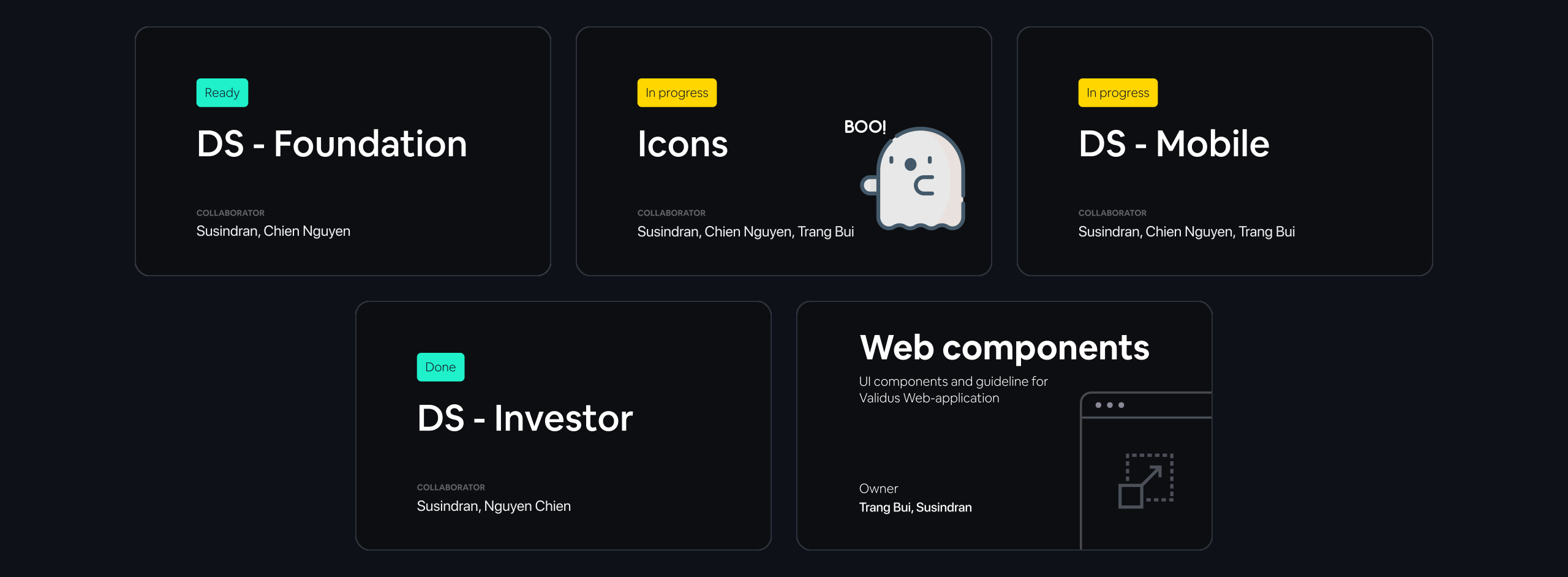
Five connected Figma libraries: Foundation, Icons, Mobile components, Investor components and Web components — each with owners and a status.
Problem
A design system is valuable when multiple teams need to solve similar interface problems without repeatedly starting from scratch. At Validus, duplicated design and development decisions increased implementation effort, made collaboration harder and introduced inconsistencies across products. As the platform expanded, maintaining separate solutions for similar interactions became increasingly difficult.
During the interface audit, we found five different button designs performing essentially the same function. This was a visible symptom of a larger problem: designers were recreating existing patterns, engineers were implementing similar components independently, and product teams lacked a common reference for interface decisions. The result was redundant work, inconsistent behaviour and additional time spent resolving UI-related issues instead of delivering new capabilities.

From the web library research, the same slider and selection controls looked and behaved differently on mobile and web before the shared system.
Key limitations included:
Existing products and deadlines
The system had to support ongoing work rather than require every product to pause for a complete redesign.
Different product requirements
Investor and Neobank experiences shared foundations but needed flexibility for their distinct journeys and contexts.
Design–engineering alignment
A component defined in Figma was only useful if engineers could implement and reuse the same behaviour.
Adoption and maintenance
Designers and developers needed documentation, clear ownership and a way to contribute improvements without creating separate component libraries.
Inconsistent starting points
Existing screens contained overlapping patterns, making it necessary to distinguish genuine product-specific needs from unnecessary duplication.
Solution
I helped design and establish a shared system of foundations, reusable components, interaction patterns and implementation guidance. Working with the lead designer and engineering teams, I contributed to a library that could be applied across products while accommodating legitimate differences. We connected the design definitions in Figma with developer documentation in Storybook and supporting guidance in Confluence, so the system could be used throughout the product-development process.
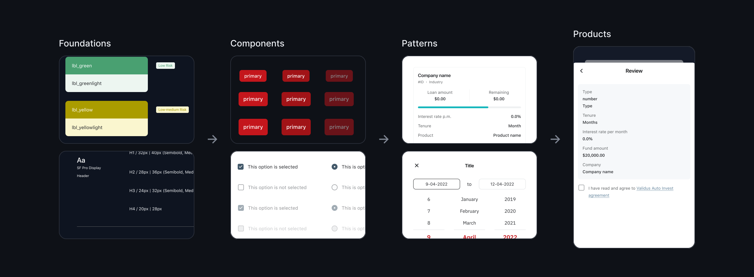
How the system is structured, colour and type foundations feed components such as buttons and selections, which form investor patterns and product screens.
What can a shared design system do?
Six connected capabilities help teams make consistent decisions without sacrificing the flexibility individual products need.
Consolidate existing patterns
We began with the interfaces already in use, identifying components that served the same purpose but had been designed or implemented differently. Similar elements were grouped into common patterns, while genuine differences were retained as deliberate variations.
This gave teams a practical route from existing products to a shared system. Rather than introducing an entirely new visual language disconnected from production, we could show which repeated decisions were being consolidated and where the resulting components would be used.

From sketch to component, selection types, states and variants were agreed first, then built as one component set with selected, disabled and error states.
Establish shared foundations
The system defines common colour, typography, spacing and layout rules that components and product screens can reuse. These foundations reduce the need for designers to make basic visual decisions repeatedly and provide developers with a more predictable specification.
The objective was not to make every product screen identical. It was to create a consistent starting point so differences could be intentional, rather than consequences of teams working without shared standards.

Foundations as named tokens, text, background, system and risk-status colours with data-visualisation palettes, and the mobile type scale including financial figures.
Build reusable components
We structured the library around reusable building blocks, from basic controls to larger interface patterns. Components define their supported variations, states and behaviour so teams can apply them consistently rather than recreating similar elements for each feature.
For example, a button needs more than a default appearance. Its loading, disabled, hover and responsive behaviours should also be understood by design and engineering. Capturing those decisions once reduces ambiguity during implementation and makes future changes easier to manage.

Core components with every state documented, button types, sizes and states, date picker, OTP input and amount box.
Support controlled flexibility
Investor and Neobank products needed a coherent family resemblance without losing the ability to address different product and market requirements. We approached flexibility through shared component structures and defined variations, rather than allowing teams to create unrelated versions of the same element.
This makes it possible to accommodate legitimate differences while preserving common interaction behaviour and implementation patterns. A new product requirement can extend an existing component when appropriate, instead of automatically creating another independent version to maintain.

Investor patterns built on shared components, facility cards for active, future, closed and committed states, with loan-status and risk tags.
Align design and code
A shared Figma library alone would not solve the problem if engineers continued building components differently. We worked to align component definitions, states and usage guidance with Storybook so designers and developers could refer to the same intended behaviour.
Documentation explains when a component should be used, which variations are supported and how it behaves across relevant conditions. This reduces interpretation during handoff and helps teams resolve questions through a shared reference instead of repeated one-off discussions.

Component documentation for engineering with usage, anatomy, spacing specs and the full variant and state matrix for buttons.
Make adoption sustainable
The system needed a way to evolve as product requirements changed. We documented the library, supported handover and introduced a contribution approach through which designers and engineers could raise gaps, suggest improvements and add new components to the shared system.
This creates a clearer alternative to local workarounds. When a team encounters a requirement the system does not yet support, the question becomes whether the existing component should be extended or a new reusable pattern is needed, rather than whether that team should create its own version.
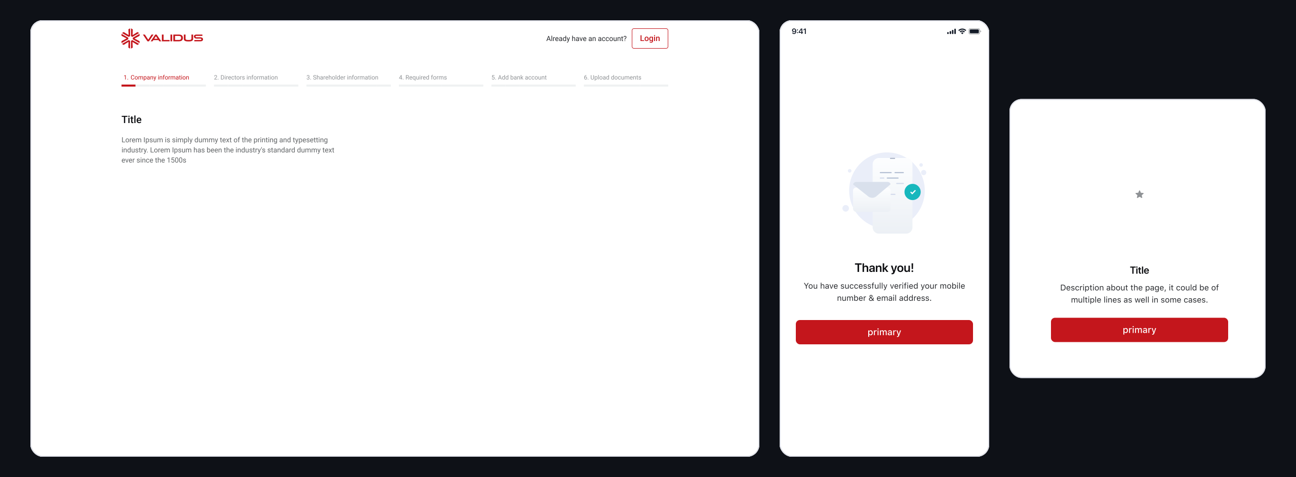
Templates teams start from — web onboarding layout, mobile confirmation screen and empty states, built entirely from library components.
Impact
The design system provided a shared reference across product, design and engineering and reduced repeated interface work. Internal project outcomes indicated faster component integration, fewer UI-related escalations and shorter design-to-launch timelines as the system was adopted.
These figures describe outcomes associated with the design system’s rollout across Investor and Neobank products. The measurement periods and cohorts should be shown alongside the final portfolio metrics so adoption gains are not incorrectly attributed to a single product launch.
~6 months
to near-total adoption
60%
faster component integration
70%
fewer UI escalations & bugs
50%+
shorter design-to-launch
Owned: product audit, foundations, component architecture, theming, Figma ↔ Storybook alignment, documentation, adoption and governance.
How I worked
With
Designers, engineers and product teams
I worked closely with the lead designer, engineers and product teams to understand where inconsistency was coming from and which patterns needed to be standardised first. Engineering involvement was important from the beginning so the system could work as both a Figma library and a reusable implementation, rather than becoming a design-only reference.
ARTEFACTS
Audit, foundations, components and documentation
My work included UI audits, component inventories, duplicated-pattern reviews, design foundations, reusable components, usage guidelines, Figma libraries, Storybook references and supporting documentation. These artefacts helped us separate genuine product differences from unnecessary duplication and gave teams a shared reference for designing and implementing interfaces consistently.
GOVERNANCE & ADOPTION
Contribution, onboarding and ongoing maintenance
I helped shape how teams would use and extend the system after launch. This included contribution guidance, handover sessions, documentation and ways to review new component requests before creating additional variants. The goal was to make adoption part of the product rather than assuming teams would automatically switch to the new library.
What I learned
A design system is a team decision
I initially saw consistency as an interface problem. Building the system showed me that its lasting value comes from helping people agree on shared solutions and use them across different products.
Audit before standardising
Similar-looking elements are not always interchangeable, and different-looking elements do not always serve different needs. Starting with real product usage helped us consolidate duplication while retaining meaningful variations.
Implementation is part of the system
A component is not truly shared if Figma and production define it differently. Closer engineering involvement and documentation make consistency more dependable than visual specifications alone.
Adoption requires ongoing support
A library does not maintain itself after launch. Clear naming, discoverable documentation, onboarding and contribution guidance are necessary for teams to keep using the shared system as requirements change.
What’s next
The next opportunity is to measure system health beyond the number of components created or the initial adoption rate. Tracking component usage, detached instances, repeated exceptions, contribution requests and system-related UI issues would make it easier to understand where the library is helping teams and where it needs to evolve.
Continued design–engineering reviews could also identify product-specific patterns worth consolidating and improve documentation where implementation questions recur. The goal is a system that becomes more useful as the product portfolio grows, without accumulating another generation of duplicated components.
More case studies